6.3 Using Technology to Model Data

Introduction
Throughout the vast grasslands of Nevada live herds of wild horses known as "mustangs". The Bureau of Land Management (BLM) has been diligently monitoring the number of mustangs and the land's capacity to support them since 1971.
A function model of that data could be used to predict the future size of the mustang herds, helping the BLM plan actions to help the herds thrive.
In this section, we will explore the process of creating function models using large data sets and then we'll return to this scenario.
General Strategy
In the previous section we found functions by hand in situations were only two data points were known. Creating a functional model from a larger dataset involves several steps including borrowing a powerful tool from statistics called regression.
While this might sound intimidating, we will utilize technology to do the hard lifting, leaving us free to focus on the analysis. Here's our general strategy:
- Align and/or Scale the Data: Before performing regression, consider aligning and/or scaling the data to make it easier to work with. If you encounter an "overflow" error when running regression in a later step, consider coming back to this step and adjusting your data to more manageable values.
- Make a Scatterplot of the Data: A scatterplot will help you visually spot trends in the data points, providing insight into the relationship between the variables.
- Compare the Shape of the Scatterplot to Known Functions: By comparing the scatterplot's shape to the shapes of functions we are familiar with (such as linear, exponential, or polynomial), we can get a rough idea of which function might be the best fit.
- Use Software to Run Regressions for Different Functions: To find the best-fitting model more precisely, use a graphing calculator or other software to run regressions for the various functions you think match the shape of the data.
- Graph the Functions with the Data: After running regressions, plot the resulting functions on the scatterplot alongside the actual data to visually assess the accuracy of each model.
- Investigate Potential Model Breakdowns: We'll examine instances where the model might not accurately capture certain aspects of the data. This investigation helps in refining the model and understanding its limitations.
While a graphing calculator or other software can give you equations and values (many of which are discussed in a full class on statistics), it can't see the data. It can, for example, find the line that fits the data best, but it can't decide if a linear model is an appropriate choice--that's up to you.
It's also important to point out that even when we can identify patterns and show a correlation in data, that doesn't necessarily imply causation between the two variables. For instance, we saw that time of day is connected to the number of observed tornados, but that doesn't mean the clock generates tornadoes. Establishing causality involves carefully designed and controlled experiments, something we'll touch on in the next example.
Example: Kepler's Third Law

When Johannes Kepler came up with his theory for the orbit of planets in 1618, he was only aware of six planets: Mercury, Venus, Earth, Mars, Jupiter and Saturn. Kepler based his theory on measurements taken years earlier by Tycho Brahe who spent his life making observations with the naked eye--he died 8 years before the telescope was invented!
Kepler struggled for 17 years to find a relationship between the time it takes a planet to orbit the Sun (called its orbital period) and its average distance from the Sun (called the semi-major axis). Let's see if we can't do something similar in less than 17 minutes. We will show instructions for using a Texas Instruments graphing calculator, but other calculators and software should have similar commands available.
The table below lists the periods and distances for the 8 major planets in our solar system.
| Planet | Distance from Sun (AU) | Orbital Period (Years) |
|---|---|---|
| Mercury | 0.39 | 0.24 |
| Venus | 0.72 | 0.62 |
| Earth | 1 | 1 |
| Mars | 1.52 | 1.88 |
| Jupiter | 5.20 | 11.86 |
| Saturn | 9.54 | 29.46 |
| Uranus | 19.19 | 84.07 |
| Neptune | 30.06 | 164.81 |
We start by entering the data into a calculator

and taking a look at the scatterplot. Using 9: ZoomStat gives a good viewing window.

The scatterplot looks like it could be an increasing power function, so we run PwrReg

and get back the equation $y=x^{1.5}$. Graphing this equation along with our scatterplot shows that it is a very good fit.

Kepler found this same equation over 400 years ago. When he unveiled his findings, Kepler stated, "It is absolutely certain and exact that the proportion between the periodic times of any two planets is precisely the sesquialternate proportion of the mean distances." The term 'sesquialternate proportion' is a way of expressing the power of $3/2$ using the language of proportionality, a concept we previously explored in Chapter 2.
All that remains is for us to turn this into a model by adding a description to our equation.
The orbital period $P$ of a planet, in years, can be modeled by the equation [ P = D^{3/2} ] where $D$ is the distance of the planet from the Sun in astronomical units (AU).
Remember that including the units of the variables is an essential part of making a model. If the data had been measured in days instead of years, or miles instead of astronomical units, then the equation would be different. Understanding the units and their relevance in the model is crucial when using the model to make predictions.
QUICK CHECK
Kepler discovered his third law by studying planets. Below are the values for some objects in our solar system that are not planets.
| Celestial Object | Distance from Sun (AU) | Orbital Period (Years) |
|---|---|---|
| Chiron (a centaur) | 13.71 | 50.76 |
| Haley's Comet | 17.80 | 75.30 |
| Pluto (a dwarf planet) | 39.26 | 248.09 |
| Eris (a dwarf planet) | 68.01 | 560.90 |
Does Kepler's 3rd law work for these objects as well? In other words, if you insert a value for $D$ into the equation $P = D^{3/2}$ does the resulting value for $P$ match the table?Answer
Yes, Kepler's 3rd law is works for all of these objects, not just planets.
Example: Allometry

In the natural sciences, many aspects of an organism's life are connected to its size. Life expectancy, brain size, gestational period, metabolic rate, just to name a few, all depend on body mass. The study of the relationship of body size to shape, anatomy, physiology and behavior is called "allometry".
For example, the accompanying table shows the weight and cruising speed of several birds.

A scatterplot of the data suggests that a slowly increasing power function with $0<p<1$, which would have a shape similar to the square root function, might model the data well.

To use the interactive figure visit https://www.geogebra.org/m/ZnU6AiQr
Running the PwrReg program gives $f(x) = 23.66 x^{0.2}$ as the best fit, confirming our initial observation that $0 < p < 1$.
We can use this function to predict the flying speed of other animals based on their weight. For instance, the giant golden-crowned flying fox is one of the heaviest bat species, with some individuals weighing up to $3.1$ pounds. Our model predicts that a $3.1$ pound flying fox has an optimal flying speed of $f(3.1) = 23.66 (3.1)^{0.2}=29.67 \text{ mph}$.
QUICK CHECK
Check to see if this function works for an airplane like the Cessna 172 Skyhawk, which has a cruising speed of $140 \text{ mph}$ and weighs $2300 \text{ pounds}$.
Answer
This model predicts a flying speed of [ f(2300) = 23.66 (2300)^{0.2} = 111.27 \text{ mph} ] which, surprisingly, isn't too far off the actual value of $140 \text{ mph}$.Check Multiple Models
In the last two examples we identified the scatterplots as a power functions. This isn't surprising, since power functions can grow quickly (when $p \gt 1$), grow slowly (when $0 \lt p \lt 1$) and decay (when $p \lt 0$).

However, it would have been better to check multiple function models. For example, the scatterplot below looks similar to Kepler's data, but no mater which values you choose for $k$ and $p$, no power function will ever fit the curvature of the data.

To use the interactive figure visit https://www.geogebra.org/m/Rv4EWJmR
In particular, it's very easy to mistakenly identify data with exponential, logarithmic or even logistic trends as being power functions. You can see the similarities in the three data sets below.

It's always best practice to try more than one type of function model to see which fits best.
QUICK CHECK
The following scatterplots have shapes similar to functions that have been discussed in earlier chapters. Discuss which functions could fit the data well.
-

Answer
This data is similar to a power function with a power of $0<p<1$, such as the square root function. This shape is also visually similar to a logarithmic function. Both should be tested to see which is a better fit. -

Answer
This data has the shape of a linear function. No other functions have this shape so it would be our best choice. -

Answer
This data has the shape of a power function with a power of $p<0$, such as the reciprocal function. This shape is also similar to an exponential decay function. Both should be tested to see which is a better fit. -

Answer
This data looks similar to a quadratic function. It could potentially be a higher degree polynomial with an even degree.
Example: Standing Mile

In the summer of 2005, Road and Track magazine gathered 13 cars, 1 motorcycle, and a Navy F/A-18 Hornet fighter jet for a one-mile long acceleration test at the Lemoore Naval Air Base in California. This started a trend and "standing mile" events are now held around the country.
At this event, the first-placed Lola Champ Car (yellow car on the bottom right) crossed the finish line in just 24.2 seconds! The following table show how long it took the Lola to reach different speeds.
| Time (sec) | Speed (mph) |
|---|---|
| 3.1 | 60 |
| 5.6 | 100 |
| 8.6 | 150 |
| 9.9 | 161.4 |
| 22 | 200 |
| 24.2 | 203.3 |
Can we find a function that fits this data? As always, we start by creating a scatterplot.

Looking at the scatterplot helps us narrow down the list of possible models. For instance, the data does not appear to be linear, so no attempt will be made at running LinReg and trying to fit a line to the data.
QUICK CHECK
Of all the functions you've seen, which one(s) do you think have a shape similar to the data in this scatterplot?
Answer
Of the functions we have seen, this might match a logarithmic function, a logistic function, or even a quadratic. In a moment we will try each of these and choose the one that appears to fit best.The equations and graphs for natural log regression LnReg, logistic regression Logistic, and quadratic regression QuadReg are shown below.

All three functions are reasonably close to all of the data points, so how do we pick the best? We'll have to rely on our personal knowledge about how vehicles behave as they accelerate to their top speed. We would expect the speed to rise quickly and then level off at the top speed. The only model that has this behavior is the logistic function, so we choose it as the best fit.
Example: K-12 Administration
The majority of teachers in primary education (K-12) are women. However, positions in K-12 administration, such as principal or superintendent, are more frequently held by men. The following data, from Indiana's department of education, shows the percent of women in K-12 administration.
 Image by ernestoeslava on Pixabay
| Year | % of women administrators |
|---|---|
| 1990 | 18.3 |
| 1992 | 22.8 |
| 1994 | 26.7 |
| 1996 | 30.2 |
| 1998 | 32.5 |
| 2000 | 34.4 |
| 2002 | 36.3 |
| 2004 | 37.8 |
| 2006 | 39.3 |
A scatterplot of the data shows an increasing, concave down trend.

Due to the shape, we can eliminate linear and exponential models from consideration.
QUICK CHECK
Based on the shape of the data in the scatterplot, which types of functions do you think could be the best fit?Answer
The shape is similar to a logarithmic function, but it is also reminiscent of a power function with a power $0<p<1$, like the square root function. It might also be worthwhile to see if a logistic function might fit.Based on the curve of the data, it seems that we should run a logistic regression Logistic, a logarithmic regression LnReg, and a power regression PwrReg.
Before running any regressions, we often align the data first. In this case, it would seem natural to let $x$ represent years since 1990. However, that would give us a value of $x=0$ and both logarithmic and power regression need $x$-values larger than $0$. To adjust for that, we'll let $x$ represent years since 1989. Now all of our $x$ values are positive.
| Years since 1989 | % of women administrators |
|---|---|
| 1 | 18.3 |
| 3 | 22.8 |
| 5 | 26.7 |
| 7 | 30.2 |
| 9 | 32.5 |
| 11 | 34.4 |
| 13 | 36.3 |
| 15 | 37.8 |
| 17 | 39.3 |
The results of the three chosen regressions are shown below.

All three models match the data fairly well. However, the logistic function has a significant flaw. Remember that the carrying capacity $c$ is a horizontal asymptote. In this case, the logistic model would never allow the percent of female administrators to exceed $40.866\%$.
Consequently, either the logarithmic or the power models might be better predictors of future trends.
Example: Redmond, Oregon

With stunning mountain views, snowy winters, warm summers and world-class outdoor activities, Redmond is one of the fastest growing cities in Oregon. The following table shows the population growth since 1970.
[ \begin{array}{|c|c|} \hline \text{Year} & \text{Population} \newline \hline 1970 & 3721 \newline \hline 1980 & 6452 \newline \hline 1990 & 7165 \newline \hline 2000 & 13481 \newline \hline 2010 & 26216 \newline \hline \end{array} ]
Before choosing a model we should plot the data and see what it looks like. To make it easier, we will use years since 1970 rather than the actual year.

The data appears to increase, slow down, and then increase again, like a polynomial function. In generally, if you notice a pattern with $n$ turns in the data you can model it effectively with an $n-1$ degree polynomial. Since the data appears to have two turns, a cubic polynomial might be a good fit.
Running CubicReg on a calculator

gives a cubic polynomial which does fit the data well, coming very close to most of the data points.
But what if we try a higher degree polynomial? Most calculators can do up to 4th degree polynomial regression QuarticReg and programs are available that can do polynomials with even higher degrees. The results of running QuarticReg

show that the quartic polynomial is a perfect fit! It hits every single point precisely.
So the 4th degree polynomial must be a better model than the 3rd degree polynomial, right? Maybe not.
Notice that our quartic model has a negative leading coefficient. Because of that the right side of the graph must eventually come down. Zooming out makes this easier to see.

While the quartic model could be a good model for a few years, it is obviously a poor predictor for the population of Redmond in the distant future, especially since it eventually gives negative population values (and you can't have less than $0$ people living somewhere).
Keeping an eye on when your model might predict unreasonable values is always important. It's even a good idea to specify a particular domain for your model. For instance, if the Census counts the population every 10 years, there's no reason to keep this model any longer than that.
QUICK CHECK
The equation of our cubic model for Redmond's population is [y=0.70x^3-23.89x^2+393.10x+3818.21] and the quartic model's equation is [y=-0.028x^4+2.97x^3-79.38x^2+798.16x+3721] Use those to predict the population of Redmond in 2020.
Answer
The year 2020 corresponds to $x=50$. Evaluating both equations gives [y=0.70(50)^3-23.89(50)^2+393.10(50)+3818.21=51248] and [y=-0.028(50)^4+2.97(50)^3-79.38(50)^2+798.16(50)+3721=41429] The actual population in 2020 was 33,274 so neither of our models produced a good prediction for 2020. In fact, from 1990 to 2010 a linear model is more accurate.Example: Wild Mustangs
We're now ready to return to the example at the start of this section. Every year the BLM conducts aerial surveys in an effort to get an accurate count of the mustangs in Nevada.
When the number of horses exceeds a sustainable level, the BLM takes action by gathering animals from overpopulated herds and making them available to the public for adoption.
The table below gives the total number of mustangs in Nevada from 2000 to 2011.
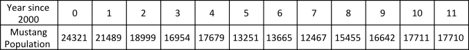
Notice that he population decreased and then started to increase, so it seems reasonable that a quadratic function might fit the data.
Since this is our final example, we will approach this two ways. First we will try using transformations to make a quadratic model in the vertex form like we did in section 6.1. Then we'll use regression and will show all the steps for using a Texas-Instruments TI83 or TI84 graphing calculators. Since a quadratic function has $3$ parameters, we will not use the algebraic methods of section 6.2 since we do not have the tools for large systems of equations.
To hunt for a quadratic model in the vertex form, adjust the values of $\color{blue}{a}$, $\color{brown}{h}$ and $\color{green}{k}$ in the figure below.

To use the interactive figure visit https://www.geogebra.org/m/FdLFe4II
With data sets like this one it is hard to know which combination of transformations will make the curve fit the data the best. It will be easier to let technology find the equation for us.
To enter the data into the calculator we press the STAT button and select 1: Edit.

The data is entered into the L1 and L2 lists, with the independent values in L1 and the dependent values in L2.

To view the scatterplot, press 2ND and Y= to enter the STAT PLOTS menu, then select the first plot and make sure it is turned on.

Using 9:ZoomStat in the ZOOM menu gives a good viewing window for the data.

Once we have confirmed the shape of the data, we go back to the STAT menu and this time choose the CALC tab.

This reveals all of the regression models built into the calculator, letting us choose the model that we think visually matches the shape of the data. Since this data looks like the square function, we choose 5: QuadReg. If the data had looked like a line then 4: LinReg(ax+b) would have been a good choice.
After running 5: QuadReg we are shown the equation that fits the data.

The result is given in the standard form $y = a x^{2} + b x + c$ rather than in the vertex form we used when trying to fit the data by hand. Copying this equation into the graphing window shows that it fits the data reasonably well.

We could now use the equation $y=239.8x^2-3147.9x+24397.8$ as the basis for a model of the wild mustang population in Nevada.
It bears repeating that a mathematical model is not the same as the real object, nor does it control the behavior of the real thing. For instance, this model might predict the future number of wild mustangs, but it is not a guarantee of what will happen.
