6.1 Concepts of Modeling

Introduction
Every spring, hundreds of people come to the Great Plains region of the United States in an attempt to get as close as possible to one of nature's most violent events: a tornado. While some go to "Tornado Alley" just for the thrill, most professional storm chasers have a different goal. What they want is data: scientific measurements that can only be found inside real tornadoes.
Scientists and university researchers, like those at NOAA's National Severe Storms Laboratory, hope to use that data to create mathematical models that will help them understand the inner workings of tornadoes and how they form.
The Modeling Process
When we speak of creating a mathematical model, what exactly are we talking about?
A model is simplified representation of a real world object. Mathematical models are found in nearly every field of study and are useful when it is not feasible, economical, practical, or safe to work with the real item.
To construct a model, we begin with a set of data points and a description of the scenario and then try to find an equation of a function that closely aligns with our observations and what we know about the situation.
Once a model has been created, we can use the rules of mathematics to discover things about its mathematical behavior. The insights gained from these analyses can, in turn, be used to make predictions and gain understanding about how the real-world object might behave.

Through continued observations and adjustments, the model can be refined to more accurately represent the real-world phenomenon it is intended to simulate.
While our models will never be perfect, there is a good chance that they might be accurate enough to be genuinely useful. Renowned physicist Eugene Wigner referred to the predictive nature of mathematics, especially in the natural sciences, as the "unreasonable effectiveness of mathematics." This theme will be prevalent throughout this chapter.
Scatterplots
Many physical laws, like the law of gravity, were discovered by gathering data and looking for patterns. One of our primary tools for visualizing data is the scatterplot. A scatterplot is nothing more than pairs of data plotted as points on a grid.
For instance, researchers from Purdue University analyzed 1285 tornadoes in Indiana from 1950 to 2012. See the paper by Olivia Kellner and Dev Niyogi in the American Meteorological Society's Earth Interactions journal, volume 18 no. 10 (2014). One set of data compared the number of tornadoes observed at different hours of the day. The scatterplot below illustrates this data.

The scatterplot reveals a distinct pattern, suggesting that most tornadoes form late in the afternoon. This is a well-known result that follows from the fact that, by mid-afternoon, the sun has sufficiently heated the ground and atmosphere enough to produce thunderstorms.
Notice that there is a subtle but important difference between the data (black dots) and the model (the red curve). The model allows us to make predictions for values that were not recorded. For instance, no data point corresponds to 10:15am, but using the model we can say the number is likely to be around 20 tornadoes.
Interpolation and Extrapolation
Models can be used to make estimations in two different ways. Making a prediction outside of a data set is called extrapolation. Estimating a value that is in between known values is interpolation.
For instance, if we knew the number of tornadoes in 1900 and in 2000, predicting how many will occur in 2050 would be an extrapolation since that value lies beyond the known data. Extrapolation assumes that an existing trend will continue unchanged into the future, which is not always guaranteed.
On the other hand, estimating the number of tornadoes in the year 1950 would be interpolation since 1950 falls between the known values.
QUICK CHECK
Suppose that we know the price of a movie ticket in 2000 and also the price in 2010, but no other years. Decide if the following would be examples of interpolation or extrapolation.
-
Predicting what the cost of a movie ticket will be in 2050.
Answer
Extrapolation because 2050 is outside of the known data. -
Estimating what the cost of a movie ticket was in 2005.
Answer
Interpolation since 2005 is in between known values. -
Estimating what the cost of a movie ticket was in 1920.
Answer
Extrapolation. 1920 is outside of the data set.
Another Tornado Data Set
Let's take a look at another set of tornado data, showing how closely tornadoes occur to populated areas.

This scatterplot reveals a strong linear trend, indicating that the percentage of observed tornadoes increases as one moves further away from the city or town center. The equation $y=\color{blue}{2.84}x+\color{green}{0.14}$ serves a good model for the data.
If we use our model to extrapolate back to a distance of $0$ kilometers it suggests that there is a $0\%$ chance of seeing a tornado, which might lead to the assumption that people in cities are safer than those in rural areas. That conclusion, however, needs to be approached with caution since many other factors may come into play.
Contrary to what one might think, tornadoes are not diverted by structures or buildings. They have been know to hit large cities, pass over rivers, climb hills and cross canyons.
Research even suggests that slower winds and hotter air in urban areas can actually increase the tornado-genesis process. According to NOAA's tornado safety guidelines, the safest place is in a fortified tornado shelter.
This example serves as a valuable lesson that even when data displays an apparent pattern, it is crucial to take time to investigate and consider other underlying factors before we make predictions or draw conclusions from our model.
Independent and Dependent Variables
In all of the tornado data sets we've seen, it was up to the researchers to decide which variable was independent and which was dependent.
Whenever we work with a raw set of data, it will be up to us to do the same thing and determine which quantity is the independent and which one is dependent.
The independent variable is the parameter that changes or controls the other variable, and it is often plotted on the x-axis of a graph.
On the other hand, the dependent variable is the outcome or response that is measured or observed as the independent variable changes, and it is typically plotted on the y-axis of a graph.
Often, certain variables are naturally independent or dependent based on our knowledge of the situation. For example, suppose researchers collect data on the dosage of a medication given to patients and their corresponding blood pressure measurements. Since researchers control the dosage, it would be considered the independent variable. Blood pressure, on the other hand, is expected to change in response to the dosage level, so it should be the dependent variable.
QUICK CHECK
-
In an experiment, data is collected on the amount of sunlight and the harvest yield of a tomato plant. Which variable would be considered dependent?
Answer
We would expect the yield to be dependent on the amount of sunlight. -
If the speed of a rocket is your dependent variable, what kinds of things might be reasonable independent variables?
Answer
Anything that influences the speed could be a reasonable choice: time since launch; weight of the rocket; amount of fuel; size of the payload; etc. -
In 1662, scientist Robert Boyle investigated the relationship between pressure and volume in a gas. Which variable do you think he used as the independent one?
Answer
This is a harder one. Boyle discovered that pressure and volume are inversely proportional to each other so, in theory, either one could be independent. In practice, Boyle, found it easier to change the pressure rather than change the volume, so pressure was his independent variable.
Aligning and Scaling Data
To make the data more manageable and relatable, we often use aligning and scaling techniques.
Aligning the data involves shifting the independent variable to a more convenient starting point. Scaling the data allows us to convert the units of the dependent variable to a more practical scale.
Let's look at an example where both of these might be helpful. The table below shows the total number of mobile game downloads on iOS and Android from 2015 to 2022.
| Year | Downloads |
|---|---|
| 2015 | 24,300,000,000 |
| 2016 | 27,900,000,000 |
| 2017 | 34,700,000,000 |
| 2018 | 38,400,000,000 |
| 2019 | 42,100,000,000 |
| 2020 | 56,200,000,000 |
| 2021 | 55,300,000,000 |
| 2022 | 55,600,000,000 |
Since 2015 is a convenient starting point, we can align this data by converting the time to "years since 2015". This is done by subtracting 2015 from each year, resulting in the aligned years 0, 1, 2, ..., 7.
Next, we might want to scale the number of downloads so that 1 on the graph represents "1 billion downloads". We can do this by dividing each value by 1,000,000,000.
After aligning and scaling our data table has the same information but with more manageable values. Notice how the labels of each column have been updated to reflect those changes.
| Year Since 2015 | Billions of Downloads |
|---|---|
| 0 | 24.3 |
| 1 | 27.9 |
| 2 | 34.7 |
| 3 | 38.4 |
| 4 | 42.1 |
| 5 | 56.2 |
| 6 | 55.3 |
| 7 | 55.6 |
Not only is the aligned and scaled data easier to read, it is also much easier to graph in a scatterplot.

QUICK CHECK
-
Suppose you have data on housing prices from 1956 through 1974. What would be a convenient starting point and how would you align your data?
Answer
Several answers are possible, but perhaps the best one would be to use 1950 as the starting year and subtract 1950 from each given year. -
Suppose you were looking at data involving the national debt, which was $31,419,689,421,557.90 at the end of 2022. How might you scale the data to make it more manageable?
Answer
Dividing by 1,000,000,000,000 (1-trillion) would give $31.42 trillion which would be easier to work with.
Modeling with Transformations
You might have noticed that the mobile game data above roughly has the shape of a line. If we find that a set of data has a shape similar to one of our basic functions, then transformations can be used to shift and stretch that function to make align with the data.
Let's start by looking at a few transformed functions that you might have seen in prior algebra classes.
Slope-Intercept Form of a Line
To begin, we take the identity function $f(x)=x$ and stretch it vertically by a factor of $\color{blue}{m}$ and shift it vertically $\color{green}{b}$ units. The resulting equation, $y=\color{blue}{m}x+\color{green}{b}$, is known as the slope-intercept form for a line, where $\color{blue}{m}$ is the slope and $\color{green}{b}$ is the y-intercept. The figure below will let you experiment with this equation.

Point-Slope Form of a Line
Another transformed version of the identity function is $y=\color{blue}{m}(x-\color{brown}{x_1})+\color{green}{y_1}$.
This new equation involves a horizontal shift $\color{brown}{x_1}$ spaces, a vertical stretch by $\color{blue}{m}$, and a vertical shift $\color{green}{y_1}$ units.
The result is a line that passes through the point $(\color{brown}{x_1}, \color{green}{y_1})$ and has a slope of $\color{blue}{m}$. We refer to this equation as the point-slope form of a line. Feel free to experiment with this equation using the figure below.

Vertex Form of a Quadratic
Lastly, consider $y=\color{blue}{a}(x-\color{brown}{h})^2+\color{green}{k}$, which is a transformed version of the square function.
The horizontal and vertical shifts move the vertex to the point $(\color{brown}{h}, \color{green}{k})$ while the vertical stretch by a factor of $\color{blue}{a}$ influences the concavity of the graph.
This equation is often referred to as the vertex form of a quadratic function. You can identify the three transformations in the figure below.

QUICK CHECK
-
Write the equation of a line with a slope of $2$ and a y-intercept of $3$.
Answer
Using the slope-intercept form, $m=2$ and $b=3$ so the equation would be $y=2x+3$. -
Write the equation for a line passing through the point $(3, 5)$ that has a slope of $4$.
Answer
With the point-slope form the equation would be $y=4(x-3)+5$. If desired, this could be converted to the slope-intercept form as $y=4x -7$. -
Write the equation for any quadratic function with a vertex at $(2, -1)$.
Answer
Using the vertex-form, your equation should look similar to $y=a(x-2)^2-1$. Since $a$ was not specified, any nonzero value will work.
Example: Apple Prices
To demonstrate how all this works together, let's use the following raw data from the U.S. Department of Agriculture.

Step 1: Choosing Variables
With this data, it seems reasonable that the year is independent and the price is dependent.
Step 2: Aligning and Scaling Data
To avoid a graph that spans $2009$ units, we choose to align the years by converting them to "years since 2000". This is done by subtracting $2000$ from each year.
And we might want to convert the price to "dollars per pound" rather than cents per pound. To do this we'll change the scale of the prices by dividing each price by $100$.
The result of aligning the years and scaling the prices is shown below.

Step 3: Using a Scatterplot to Choose a Function
Now that we have aligned and scaled the apple data, let's examine the scatterplot and compare its shape with the shapes of the six basic functions that we know.

Does the data look like the identity function or the square function? Perhaps it looks like the reciprocal or the cube root function?
Since this data appears linear, we should be able to model it with a transformed version of the identity function $f(x)=x$. For simplicity, we will use the slope-intercept form of a line $y = \color{blue}{m} x + \color{green}{b}$ but the point-slope form could be used as well.
Step 4: Using Transformations to Fit the Function to the Data
All that remains is to find values of $\color{red}{m}$ and $\color{green}{b}$ that make the model fit the data as closely as possible.
In the figure below, you are free to change both the slope $\color{red}{m}$ and the y-intercept $\color{green}{b}$ until you find a line that fits the data. Make a note of your equation before continuing.

You may have had trouble finding just one line that fit well. In fact, good arguments could be made for several lines. However, the line that is as close as possible to each point is the line $\color{blue}{y} = \color{red}{0.04}x + \color{green}{0.86}$.
Where did this equation come from, and how do we know it is the best? Well, that's a great question would take a few weeks in a statistics course to explain fully. For now, it's enough to know that most graphing utilities have programs that fit equations to data. That process is called least squares regression and we will look at it later in this chapter.
Step 5: Constructing the Model
Now that we have an equation, $\color{blue}{y} = \color{red}{0.04}x + \color{green}{0.86}$, it's time to turn that into an actual model.
A model is not just an equation or function, it also includes a description of the variables and their units of measure. Without an accurate description, the function itself is meaningless since there would be no way to relate it to the real world.
Since our independent variable is time in years since $2000$, we take the liberty of using $t$ in place of $\color{blue}{x}$.
Similarly, using $p$ instead of $\color{blue}{y}$ will help us remember that the dependent variable represents the price of apples. We are now ready to write our model.
According to data provided by the U.S. Department of Agriculture, the price $p$ of apples per pound in dollars can be modeled by the function [ p(t) = 0.04t + 0.86 ] where $t$ is the time in years since 2000.
Step 6: Using the Model to Make Predictions
We can use this model to estimate the price of apples in any year we want. For example, to predict the price of a pound of apples in the year 2030 we simply evaluate the function for $t=30$ (remember, $t$ is years since 2000.)
[ p(30) = 0.04(30) + 0.86 = 2.06 ]
Thus, our model predicts the average price of a pound of apples will be $2.06 in the year 2030. How accurate is that? We'll have to wait and see.
Modeling with Piecewise-Defined Functions

The Pompidou Center in Paris has an amazing escalator. Designed by Italian architect Renzo Piano and British designer Richard Rogers, the 6 story escalator is encased in a glass tube and attached to the outside of the building!
The Pompidou escalator is not a single straight line, but rather several small lines pieced together. It's an example of a new type of function which we'll call piecewise-defined functions. For instance, to model the Pompidou escalator we shift and stretch several pieces of the identity function and connect them together with horizontal line segments.
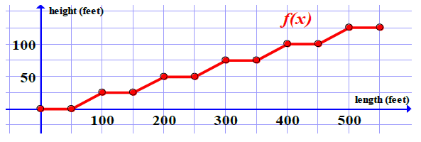
Piecewise-defined functions, such as this, give us a lot more flexibility when creating models. No longer are we required to find a single function; we are now free to construct models in multiple pieces.
When writing piecewise functions, we list the equations for each piece and then specify where each is used. Consider, for example, the path a bounding ball.

Each bounce is an individual parabola, with its own equation, and its own limited domain. The piecewise function for this particular ball is
[ f(x)=\begin{cases} -(x+2)(x-2) & \text{if } & 0 \leq x \leq 2 \newline -1.2(x-2)(x-5) & \text{if } & 2 < x \leq 5 \newline -1.8(x-5)(x-7) & \text{if } & 5 < x \leq 7 \end{cases} ]
To find a value such as $f(4)$, we first compare our x-value $4$ with the three inequalities. Since $4$ would fit in $2<x \leq 5$, we must use the second equation. Thus, $f(4)=-1.2(4-2)(4-5) =2.4$.
QUICK CHECK
Use the piecewise function above to evaluate the following:
-
$f(0)$
Answer
$-(0+2)(0-2) = 4$ -
$f(2)$
Answer
$-(2+2)(2-2)=0$ -
$f(6)$
Answer
$-1.8(6-5)(6-7)=1.8$
Looking Ahead
In the final two sections of this book, we will approach mathematical modeling from two different perspectives.
In 6.2 we will have limited data and will need to find a suitable model based on descriptions of the situation and our knowledge of how linear, power, and exponential functions behave.
In last section we will explore the practical application of using graphing utilities to create scatterplots and find functions that best fit the data.
Throughout it all, remember that while models are powerful tools, they are not infallible. Careful consideration of underlying factors is crucial for drawing meaningful insights and making accurate predictions.
Additional Practice
Want more practice? Try these optional exercises powered by MyOpenMath. These exercises are purely for practice and are not part of your graded homework - you can attempt them as many times as you'd like!